mu mockup
Aug 2017 - March 2018
muMockup is an internal Mu Sigma tool for building data analytics dashboards using pre-built templates. It offers a rich gallery of customizable data charts, several ready-to-use interactive widgets, and design space to create custom dashboards.
My Role: Research, creating UI concepts and prototype
Skills: UX Design, User Research, Problem Solving
To comply with my non-disclosure agreement, I have omitted and obfuscated information in this case study.

Problem space
How did it start?
The idea of a mockup tool for data scientists at Mu Sigma was conceived in the fall of 2017. The head of R&D at Mu Sigma noticed that data scientists were spending 3-4 days creating mockups before reviewing with their managers, eventually delaying the whole analytical pipeline. And given that these dashboards were utilized for making critical decisions, there was a need for a tool that could speed up the process.
Within months we created an MVP. Besides creating custom dashboards, the platform provided other features, such as publishing custom-made templates, saving them as HTML or .jpg, or .pdf files.

Big wake up moment
Low adoption for a product that was supposed to be useful!
We launched the tool in Dec 2017. Users liked the idea as it compartmentalized their workflow and enabled them to create mockups rapidly using templates. However, the tool didn't get the response we anticipated. Of the 300 users who used the beta release, nearly 65% weren't happy. They either signed up and abandoned, or they didn't see the value in using the platform. The conversion rate was woefully low, and this for a product that was supposed to be useful.
challenge
How to bring in more users?
Along with bug fixes, I was tasked with improving product UX to increase engagement with the tool and increase the acquisition.
176
Number of active users
4-5
Number of hours required to make a dashboard
Discovery
Why are users not using the tool?
We built a feedback system within the product to get real-time feedback on what was working and what wasn't and use the data to decide what changes to test next.
However, since we had only a few users using the tool, I had to use a different channel to get user feedback. So I sent out a survey to every business vertical within the company, asking users one simple question:
Would you be disappointed if the mockup tool ceases to exist?
The options were: Very disappointed / Not disappointed / Somewhat disappointed / NA. I wrote the question this way because I found asking if they were satisfied using the tool didn't deliver meaningful insights; disappointment was a much better gauge of product loyalty and satisfaction.
The collective response was surprising. Most users said they would be very disappointed, and this strong response meant there was massive potential to improve the product.
Findings from interviews
Next, I interviewed and observed users while they used muMockup. This gave me an understanding of why they are not using the tool.
Restricted canvas space
Space available for creating a dashboard was restricted. Users with low-resolution laptops had significant difficulty while designing a mockup. While the panes were readily available when required, the level of focus was reduced
Navigation issues
Users were spending more time navigating the interface than creating a mockup. The layout of the interface wasn't optimized to cater to users' needs.
Unorganized property pane
Users had trouble finding widget properties to customize. The properties were not grouped efficiently.
ideation
Wireframes and initial design ideas
The main focus was to find a way to de-clutter the interface while keeping functionalities accessible. I explored different ways to provide more real estate for users to create dashboards and also to provide a more structured way of accessing different functions within the tool.

Solutions
Designing a clutter-less canvas
Identifying users' specific goals and breaking them down into specific and manageable tasks was crucial to their decluttering journey. Decluttering also shifted the load from the user to the system.
Hover over the image to see Old vs New layout
Rethinking navigation and accessing components
Real-time usage data showed 86% of users' actions involved dragging and dropping components on the canvas. The application's core feature that delivered customer value was determined to be the ability to create and customize components.
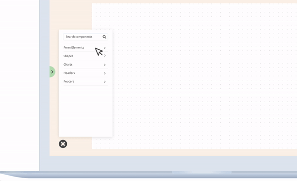
An identifiable floating action button indicates that users can trigger an action with a single tap.

On-demand / Contextual property pane
The contextual property pane is robust in organizing the properties of each component and reduced the time taken to adjust a property.
MEasuring Success
I conducted thirty minutes long 1:1 session with 15 participants in the age group 22 - 31. All the participants were Data Scientists/Analysts working in 5 different business verticals.
The session was split into 3 segments - a background interview, direct observation followed by a brief semi-structured interview. During the direct observation, participants were asked to create a dashboard.
FINDINGS
Participants loved the new design. They especially praised the ease of navigation and being able to change properties easily. However, some participants raised concerns regarding custom components. They wondered if they could save their own custom components.
IMPACT
-
The number of active users increased from 176 to 827 in one quarter.
-
The number of daily visits improved from 51 to 233.
-
The average time spent in creating a dashboard decreased from 4-5 hours to 1 hour.